Step 2: The template settings
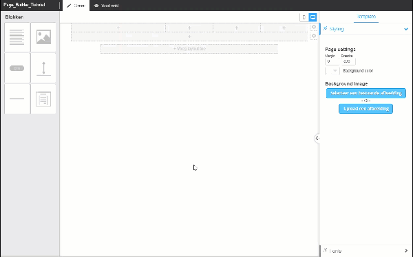
We will now enter the template settings. The width of the page is very important for this. Within this width you are able to place your content. Outside this width you can add any further background images. For the Landing Page that we will now make we will select a width of 800px and white as the background colour. We leave the standard settings also for the fonts.
Step 3: The top menu
We now start on the content of the page. In our example we start with a top menu. As you can see, the editor is the same as the drag & drop editor of the Creative Template.
In order to recreate the top menu from the example we choose a 4-column layout. Clicking on the cog all the way to the right of the layout allows you to change the layout. We will first place the 4-column layout at the very top of the page.
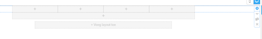
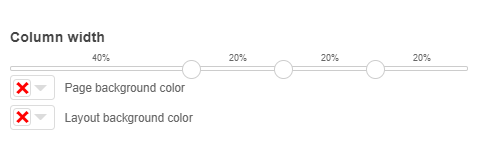
We then use the slider on the layout menu in order to give the left column (where the logo is to be placed) a width of 40%. We give the other columns a width 20%
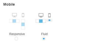
As we want the menu to remain alongside one another in the mobile display as well, we give this layout the option “fluid”. This scales down the items, but they do remain next to one another. In this case we do not select responsive (which displays images below one another).
We now add the content in the top menu. Drag the images block in the left column and add a logo there (you will find the logo in the download). Add menu items in columns 2, 3, and 4. We have selected “Website”, “About” and “Contact”.
The various blocks are given the following padding:
Logo: 20px, 20px, 20px, 20px
Menu: 30px, 20px, 20px, 20px

 (No Ratings Yet)
 Loading...